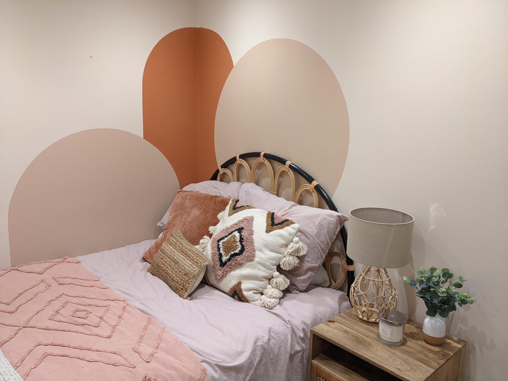
Case Study - Scandi boho teen bedroom
Written by Catherine Seagrave
How we transformed a dark, awkward shaped and unloved study into a dream scandi boho teen bedroom
Recently we worked with a lovely family who wanted to create a new bedroom for their teenage daughter. They were keen to design a room with longevity, one that would suit her tastes now whilst she was still quite young, but that she would also still love in a few years time too. They knew that they wanted the room to have a scandi boho feel with some rattan and neutral colours, and practically it needed a double bed, storage and a desk.
However, the room came with challenges. The main one being the lack of windows, or a view. The light in the room came only from a high skylight. The second challenge was the size. The room was less than 2m wide and nearly 6m long. Without careful planning the room was going to look like a dark tunnel! Not an ideal look for a 13 year olds bedroom!
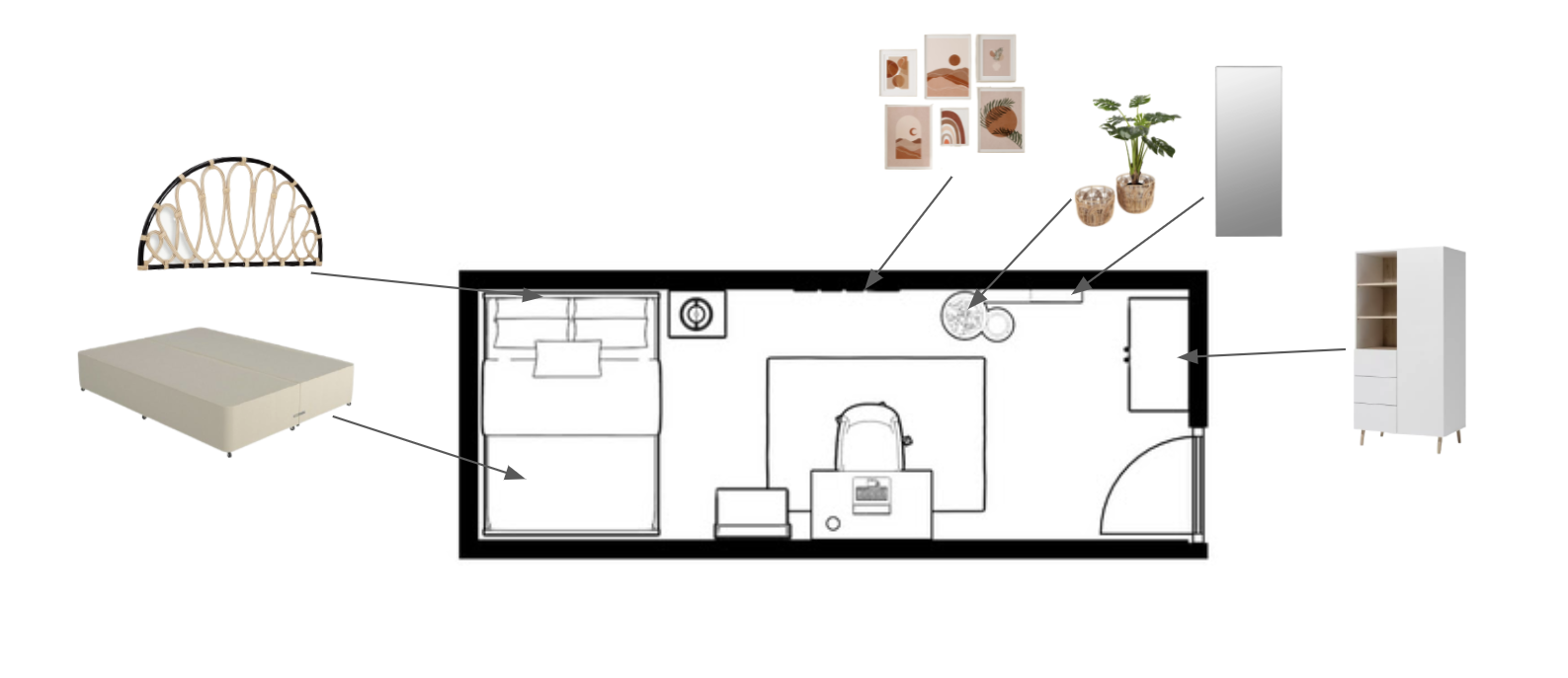
The very first step, before we even considered the style or colours further, was to get the layout right. What was possible in the given space? What was going to help minimise the corridor effect?
In order to shorten the room, it made sense to put the double bed across the room at the far end. If the bed was turned towards the door, it only emphasised the narrow width, creating a skinny awkward area beside the bed. However not all beds would fit this narrow width. With some searching we found a double bed and headboard that would fit perfectly as the headboard was wall mounted and so the fitting did not add extra length to the bed.
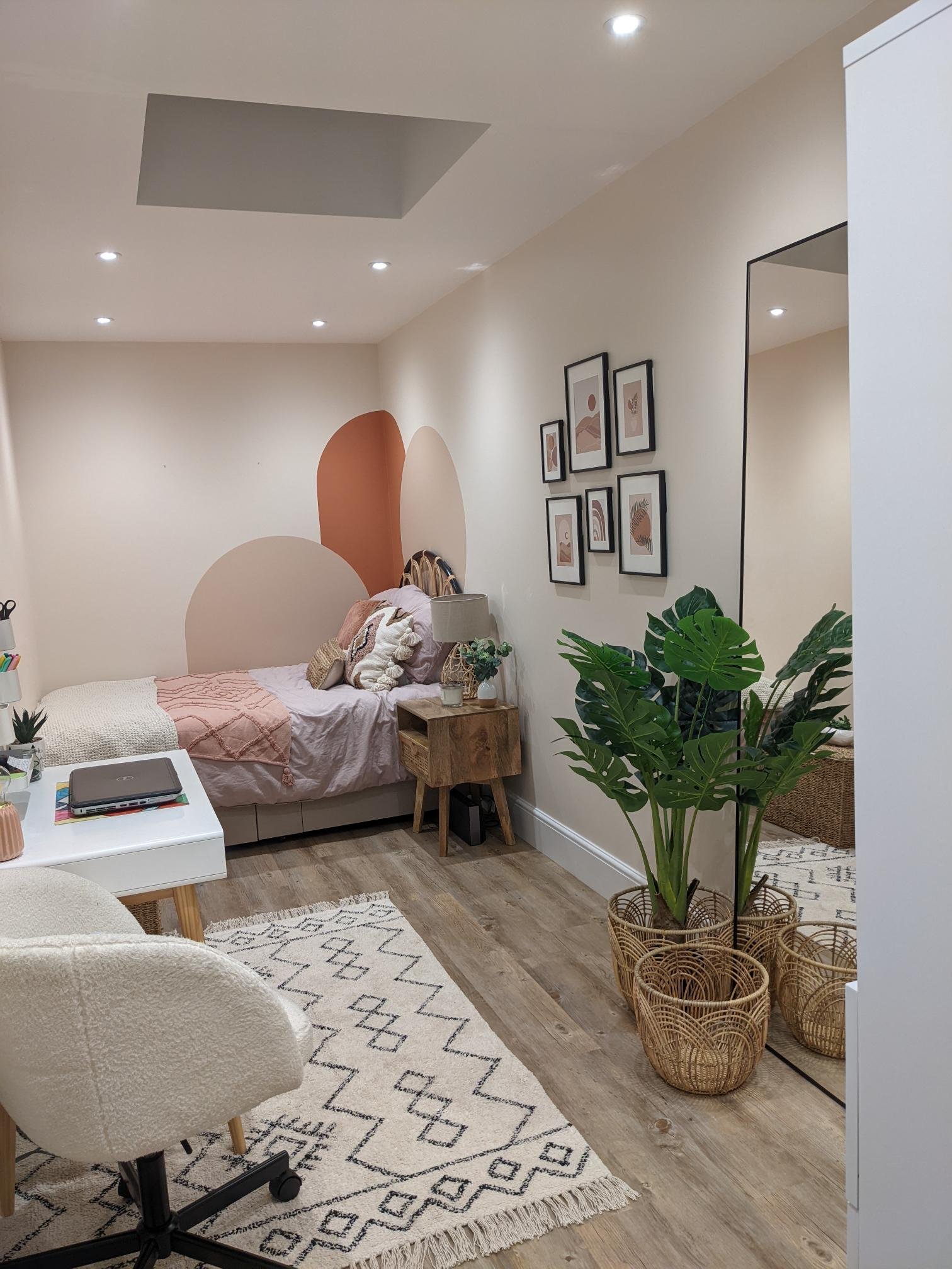
The next big piece of furniture to place was the wardrobe. Again placing it on the long wall would have added to the corridor effect, whereas placing it behind the door shortened the length further. After that it was thinking about how to create interest along the long wall, to break up the space and give your eye places to rest along the length. This was achieved with a desk area and a gallery wall with a long mirror and plants.
Are you struggling with the layout in your room? Click here our Midi Living package is the perfect solution!
With the general layout decided, it was time to bring interest and style to the room. The whole room was to be painted in Dimity, a light soft taupe colour from Farrow & Ball. Without a window and a view, the room still felt like a box. It needed a focal point and something to soften the rectangular shape.
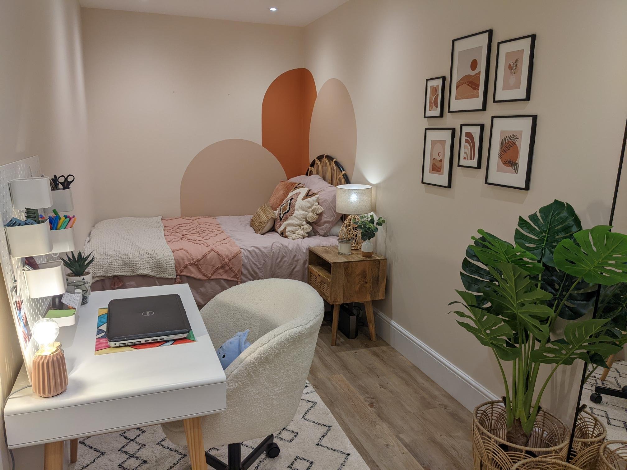
A colour block feature wall was the answer! We designed three large interlocking arched shapes which wrapped around the corner of the room, framing the bed and drawing the end wall in towards you. The colours were soft earthy tones of terracotta and plaster to bring warmth and character to the room, and create the feel of a cosy sleeping nook. The shapes were echoed again in the headboard with the open cane pattern allowing you to see through to the paint effect.
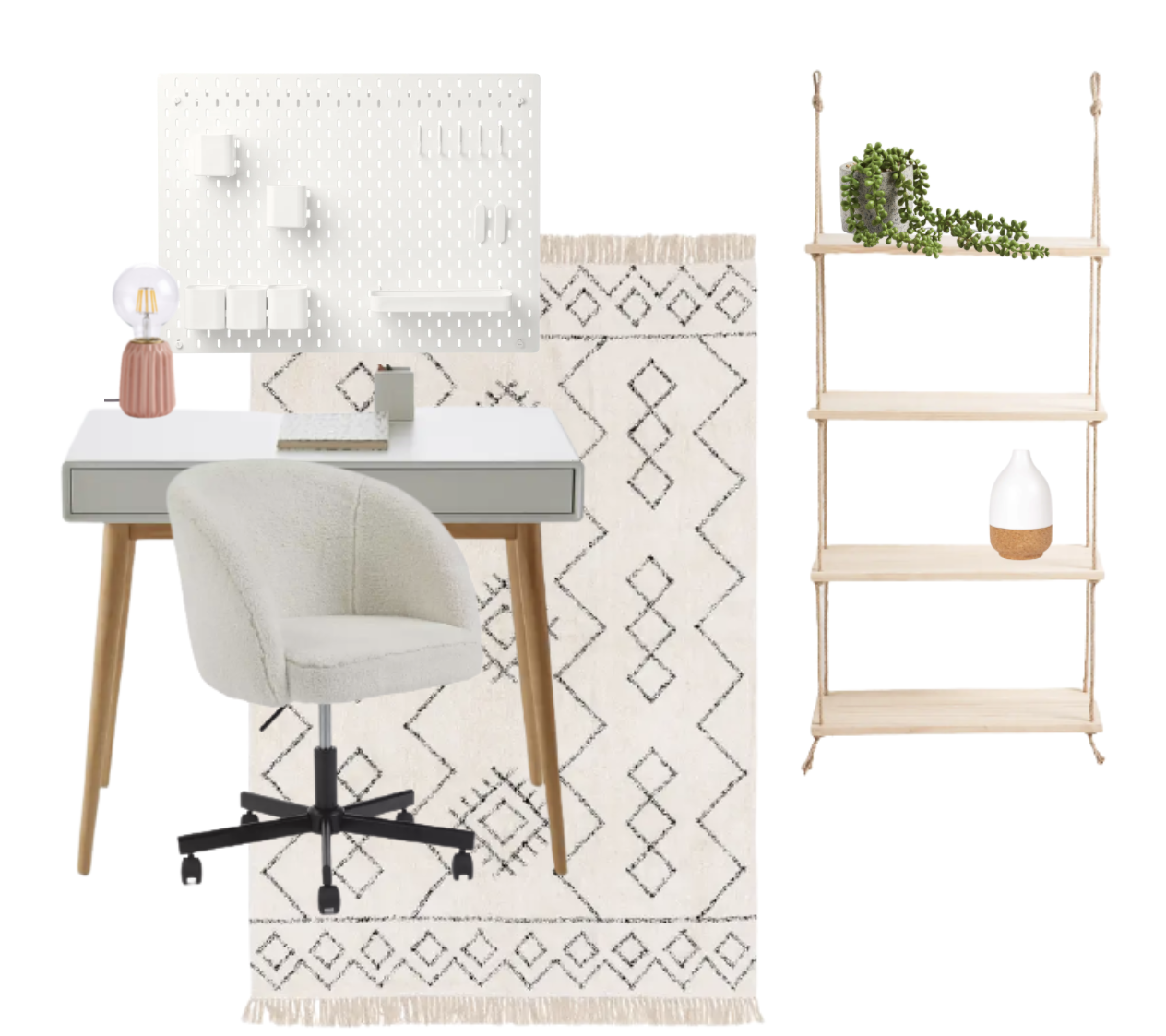
The next step was to create zones within the room, to help it feel larger and wider. To help zone the desk area, we used a soft Berber style rug which went under the desk and created a middle section to the room. The area needed height so an open sisal rope and pine hanging shelf unit was added beside the desk with a peg board above it. To stop it looking too officey, and keep the teenager bedroom feel, a fun boucle desk chair was chosen and a small pink desk light.
Do you struggle to visualise how your room could look? Let us help you, click here.
To give balance to the desk area, a gallery wall was added opposite, complimenting the shapes and colours of the colour block walls. Next to this a large mirror helped to bounce light around from the skylight above. And a large plant in a rattan basket finished the look.
To really fulfill the brief and give a playful boho feel to the room, we accessorised with patterned and textured cushions, cosy throws for the bed and more rattan accents.
And most importantly the customer was delighted!
“We were finding it impossible to decide on the best layout for my daughter's long and narrow bedroom. The team at The Living House really listened to my daughter's tastes and needs for the room and provided a clever and beautiful plan and mood board. Our budget was also clearly considered.”
Before
After
Have a chat with us and find out how we can help you. Book a discovery call with us today!
The Living House Trade Secrets:
Remember to work on the floor plan first, before you select your furniture.
Try to minimise the worst features of the room (in this case the shape), and trick the eye to see it differently.
Look for different ways to add interest, here we used colour blocking.
Create zones within the room to make it feel larger.
If you would like some help updating your home, and figuring out how to overcome the challenges in the room, please get in touch. We’d love to hear from you and create a beautiful scheme personalised to your style and budget.


